Increased conversion by re-designing product listing page
Redesigned E-Commerce product listing page for better user experience, faster load-time, and better conversion. Along with the redesign, I was responsible for adding new facet features, product flags, and content components for marketing purposes. I was the UI/UX lead and responsible for competitor analysis, research, wire-frames, high-fidelity mockups, dev support, and UAT to make sure the redesign is implemented as per requirement.
The Challenge
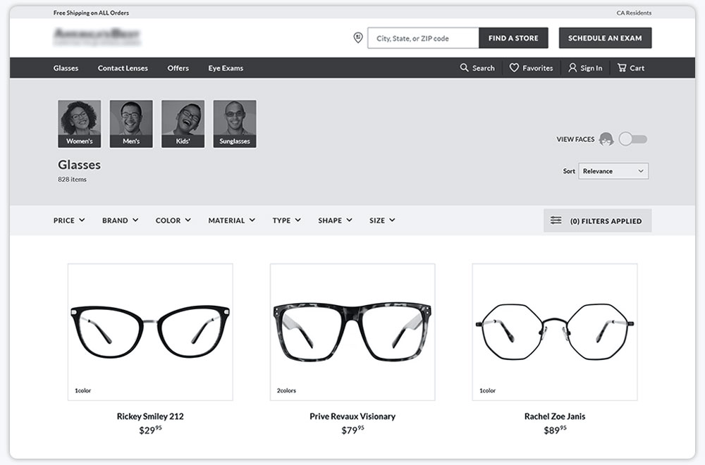
The product listing page had unnecessary white space. The first product row was below the fold on laptop/tab devices and mobile devices. The filters were slow, it would not apply until the user clicks on the “Apply Filter” button which was creating high frustration areas, especially in mobile devices. The virtual try-on feature was creating high load-time in displaying the results after activation, some frames were looking cropped in a small area.
Some features like Favorites and 2-pair price were hidden and not visible until the user hovers on the desktop. The page was overall hard to navigate on small tablets and mobile devices.
Original Design
Research
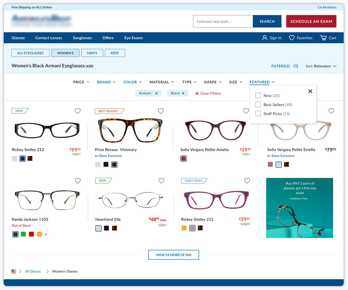
I took extra time for research and competitor analysis for a cleaner solution. The priority goal was to clean up the extra white space and remove the high frustration areas like product column hover effect, filters, and mobile UX. Upon competitor analysis using content-square, I found out users preferred instant filter applications behind the scenes and medium to small product image size which would help them view multiple products at a time.
Research also showed users would prefer favorite their products before logging in so they can go to their favorites and make easy purchase decisions. Research also showed the existing filter facets order would need to be changed. After researching and compiling the data into a wireframe to high fidelity design, the new features were approved and were ready for development.
Research also showed users would prefer favorite their products before logging in so they can go to their favorites and make easy purchase decisions. Research also showed the existing filter facets order would need to be changed. After researching and compiling the data into a wireframe to high fidelity design, the new features were approved and were ready for development.
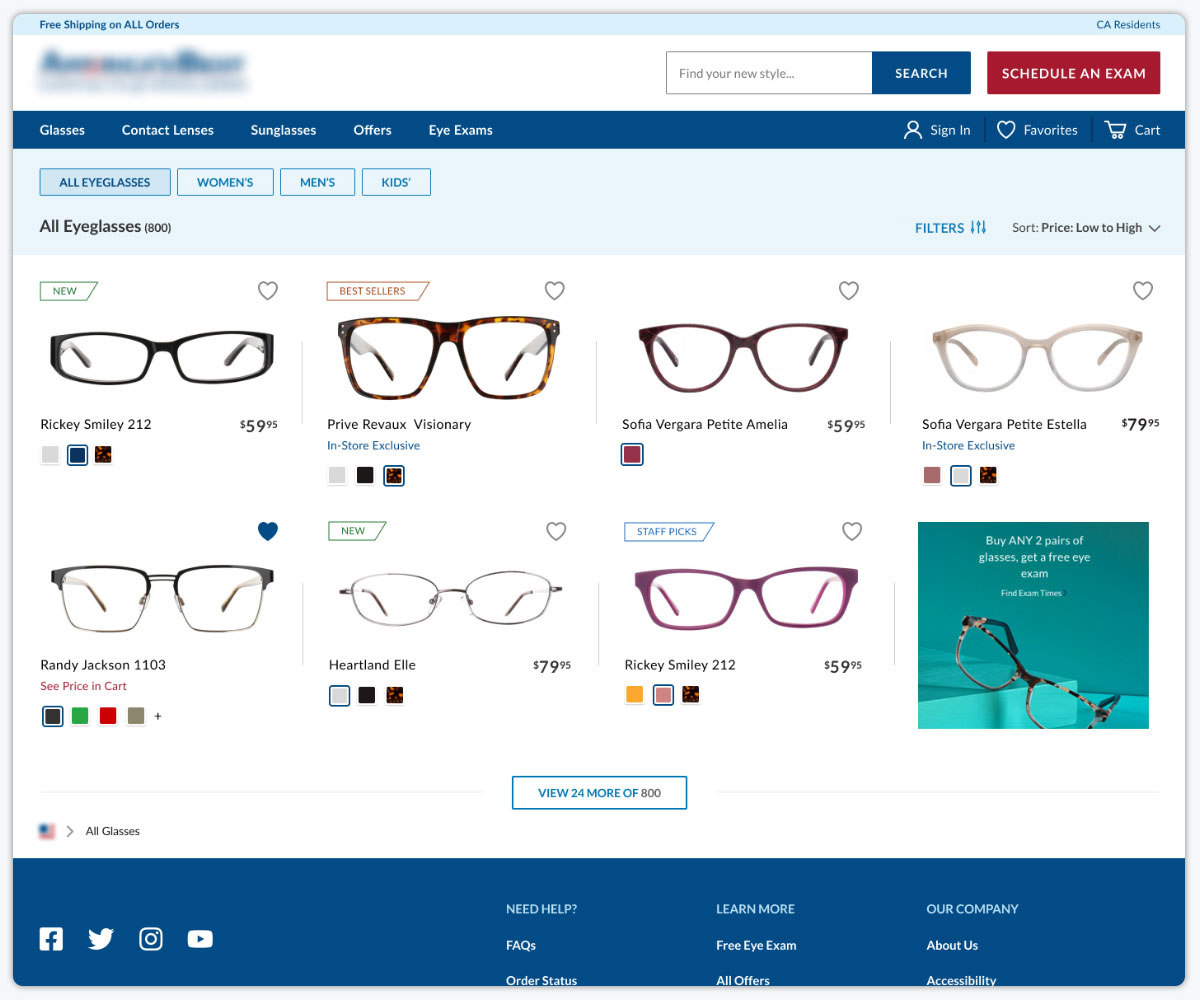
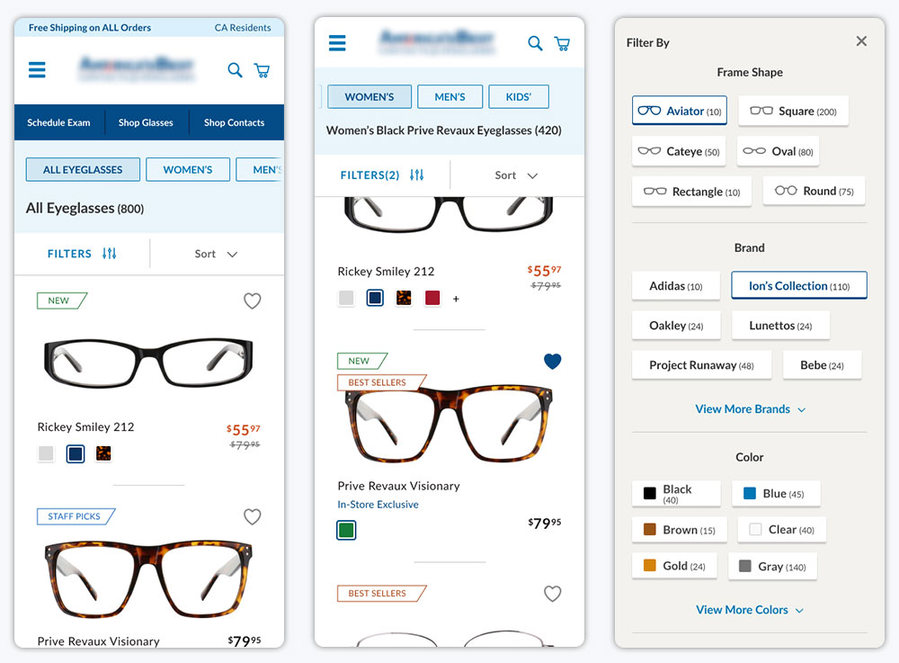
New Design
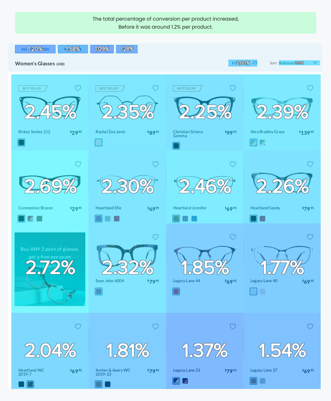
Result
The research helped approve the new condensed design and instant filtering flow. The feedback we received from shoppers was extremely positive, the faster page load and instant filtering on the flow were loved. The new facets and flags helped users make faster decisions.
Beyond the boost in positive sentiment, we’ve also seen a significant decrease in frustration areas and more conversions to the product detail page and checkout.
Beyond the boost in positive sentiment, we’ve also seen a significant decrease in frustration areas and more conversions to the product detail page and checkout.
Some Positive Outcomes
- The new UI was loved by everyone in different departments.
- The new design significantly decreased frustration areas, specially on filters.
- Users could easily understand and access filters in mobile.
- Simplified category buttons were loved, especially on mobile. Saw higher click rates on new button design compared to old ones.
- Revenue per click on products were increased.
- The new facets and flags helped users make easy purchase decisions.
- Overall saw an increase in conversion to the product detail page.
- New facet flags were a big plus for merchandising and marketing in promoting the products and discounts.